Digital Billboard Effective Design
Zalla Outdoor’s “Blaze” offering will help solicit over 712K user per week. Now that you know you have that many people, experts recommend that billboards be between 6-7 words. Remember: The average viewing time is only about 5 seconds.
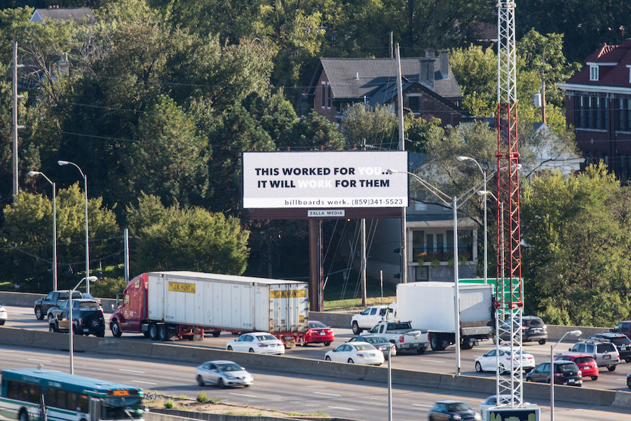
Great billboard design that generates revenue isn’t easy work. Experts recommend that billboards be between 6-7 words. Remember: The average viewing time is only about 5 seconds. A good test is to show the design to someone from a distance for only 5 seconds and then ask them about it. However, a digital billboard has a number of distinct advantages and opportunities that can help you deliver your most effective messaging. Here are some best practices we thought we’d share from our clients below (and don’t forget to download our advertising fact sheet too).
Effective Design Tips
- Make the text large
Outdoor designs should be simple, clear and easy to read. Digital bulletins should be legible from 600 feet away. - Use bold, non Serif fonts
Always use large, legible typefaces. At 600 feet, thin lines optically fade or break up. Avoid decorative, italic, or serif fonts. As a general rule, upper and lower case sans serif fonts provide the best readability. When designing for digital outdoor, we highly recommend adding a thin dark stroke around the text to separate it from the background. - Stick to one message or idea
Simplify everything. Don’t present a complex message or numerous images. Have one thing that you want your audience to do or to recognize. The best outdoor media reduces a complex message to it’s essential elements. - Be short and sweet
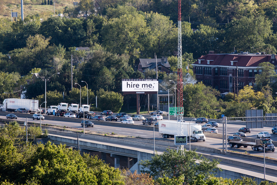
Use no more than ten words total on the entire billboard – and that includes the logo/product tagline. We recommend six words or less for the headline. Keep the words short for faster comprehension. - Color
Use only RGB color files for digital displays. Design as you would for a website, tv or computer monitor. - Avoid white backgrounds
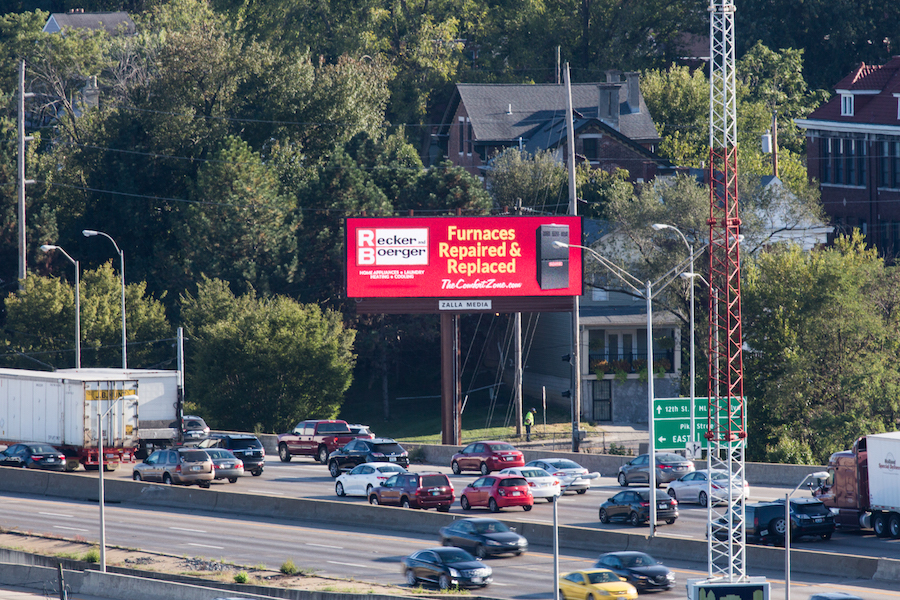
To achieve white, a combination of all three colors must be turned on to their maximum brightness. Consequently, white backgrounds will wash out and compete with the remainder of your creative. - Use bright, bold colors
Stick with fully saturated web-safe hues. Complimentary colors, such as red and green, are not legible together because they have similar value. Contrasting color combinations work best for viewing outdoor designs at far distances. - Design with high contrast
Being subtle does not work at great distances. Strong contrast in both hue and value are essential for creating good digital out-of-home. - Pick your image wisely
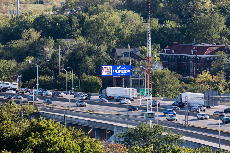
Take a small object and make it large (like a watch) rather than a large object small (like a building). Avoid using landscapes or complex scenes. We recommend 3 visual elements or less, total. For example: 1 image, 1 logo and 1 headline. - Forget about white space
White space does not apply in outdoor like in printed material. Increase your logo, font sizes and imagery. Having unused visual space at 300 – 600 feet is not recommended.
Creative Best Practices
- Test your idea
Zalla Outdoor’s billboard is digital. This means that you have the ability to test your messaging and see what resonates with your customers. We’re going to share our wisdom as you go, but there is nothing like testing your content. We make that easy. Simple questions include: Did they understand it? Who was the advertiser? What do they think the advertiser wants them to do? - Use proximity to your advantage.
Some of our best and most successful clients use the proximity and time to their business to their advantage, e.g. “Awesome food is just five minutes away”. Since Zalla Outdoor’s digital billboard is just a couple minutes from Downtown Cincinnati, on the I-75/I-71 corridor, your close to everything (that means it’s probably going to work for you!) . - Dayparting is your friend.
Dayparting is the practice of catering your message to the time of day (or can be used for other triggered events like the weather). For example, if you’re a roofing company wouldn’t you want your message to resonate immediately post rain, like “roof leaking?”. Zalla Outdoor can help customize your messaging solution. - Use seasonality to your benefit.
The I-75/I-71 corridor is a major thoroughfare all times of the year. That said, a seasonal message for your most recent promotion is something that is easy to do with a digital billboard. - Creative inspiration
Use the weather, temperature or otherwise to influence your creative design. For example, were you a tire dealer you could try “wish you had those new tires now?”. Use those moments of truth to influence and make your creative memorable.
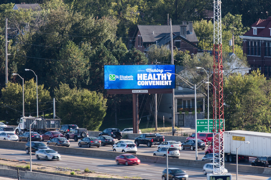
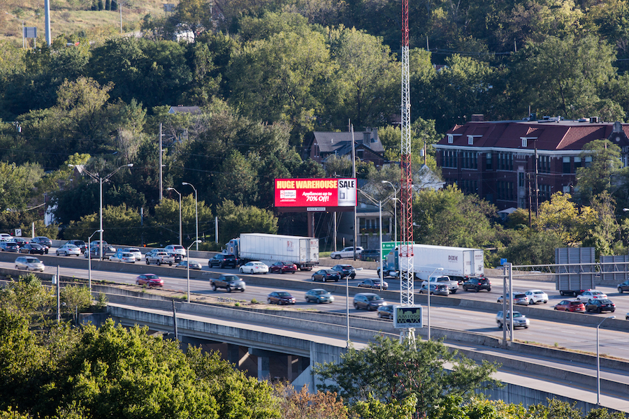
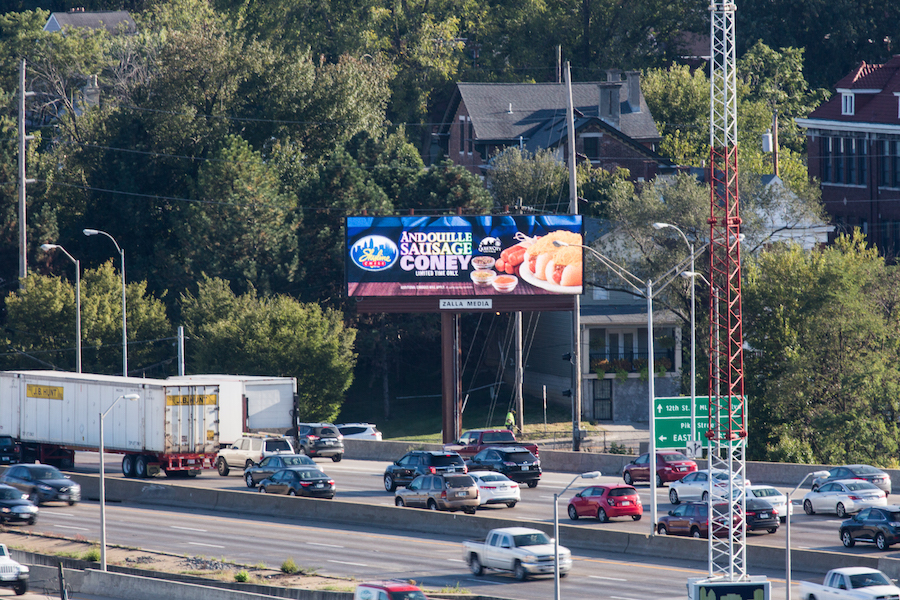
Zalla Outdoor’s billboard is designed with less room between the lights. We’ll skip all the nerdy stuff, but this means for our advertisers, you’ll receive a brighter message that’s easier to read any time of day. We’re here to help make your billboard experience effective. Get started now!
